
Komfort - Menstrual Product Brand

Project Type: Brand Identity, Packaging, & Marketing
Role: Lead Designer
Komfort is a safe, sustainable, and gender-neutral menstrual product brand. Menstrual products are generally non-sustainable, and studies have found that many of them contain toxic materials. The current branding for these products can be extremely gendered and face stigma and misunderstanding. Komfort uses minimalist designs, soft colors, and rounded shapes to create a warm and friendly appearance.
The result is a full brand identity with developed packaging, website, and marketing designs that are capable of being replicated for further brand development. The designs were made to feel friendly, calm, and welcoming while the marketing and the website emphasize the three core goals of the brand so that any potential consumer can feel confident and comfortable in their decision to buy from this brand.
Ideation & Development
Over the course of four months in the spring semester of my senior year at Penn State, I developed my senior capstone project. We were given the freedom to do a project on any topic we wanted as long as we created a well thought out, elaborate, and cohesive end product.
Extensive research, detailed planning, and constant experimentation helped clarify my vision and bring it to life. Through peer critique and feedback from my professor, I went through several iterations of the branding, packaging, marketing, and website design for Komfort.
Take a peek at the process documentation I created to showcase the all the development and ideation this project went through!


Product Packaging
Komfort gave me the chance to really dive into packaging design for the first time. I experimented with the layout of information along with how to use colors and patterns within my brand to differentiate each product. The color of the box represents the type of product and the pattern represents the size/heaviness of the product.
I also took into consideration how a consumer would view the box in a store versus at home, making sure that no matter how the box was positioned you can tell what product it is at a glance. The packaging includes relevant information, a slit to close the box once opened after purchasing, and a friendly statement on the inside of the box.
Explore all four of the boxes I created at every angle!
Posters & Social Media
Marketing is a crucial aspect of this brand, especially if it was real, but it is also an area that I am less confident in. I knew that it would be a good challenge to tackle some marketing material for Komfort. I chose to focus on creating posters and social media posts, mainly for Instagram.
In order to make sure everything was cohesive with each other and the rest of the branding, I took inspiration from Komfort's three main goals when coming up with the subjects of each post/poster. I kept the tone friendly, warm, and inclusive while the designs remained simple and mostly monochromatic.
I purposefully avoided using people in most of the marketing in order to build the brand's reputation of being gender neutral. If I expanded upon this brand in the future, I would like to include a wide range of people in new marketing material to further push towards gender neutrality.
A video and gallery display the marketing material I've created!


Website Prototype
Another aspect of this project was to create a website that would provide information on the brand, its cause, and the give the ability to purchase their products. I developed the home page, an about page, the all products page, and the individual product page for the four products I had already created packaging for.
While the website lacks the actual functions of a real site, through Figma I created a working prototype that could be explored by others. There is also plenty of room to expand upon this prototype while also already having a strong design system to work with.
To get a feel for how the website would look on your computer, view some mockups that have been created!
Exhibition Booth
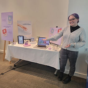

The senior capstone exhibition was developed by my entire class to showcase our projects to family, friends, faculty, other students, and graphic design alumni. We decided on the theme, created branding guidelines, posters and flyers, Instagram posts, a website, and a booklet with each of our projects described inside.
Each of us were tasked with creating the layout for our booth along with bringing in physical and digital parts of our projects to showcase. I presented my physical packaging, posters, a digital display of my social media posts, and my website that viewers could look through. I also handed out stickers and business cards along with explaining my project and answering questions for attendees.
Check out a few pictures of my booth and myself at the exhibition!
